DATA VISUALIZATION
Topics Covered:
- Module matplotlib
- Module numpy
- Creating charts
- Predictive analytics

Data Visualization
The phrase “A picture is worth a thousand words” is probably familiar to you, and dates back to at least the early 1900’s. The basic idea is that a graphic can often tell a story more effectively than several paragraphs of descriptive text. In this chapter, data visualization techniques will be explored that allow us to produce such graphics using simple, easy-to-understand Python code.
Module matplotlib
According to matplotlib.org, “Matplotlib is a comprehensive library for creating static, animated, and interactive visualizations in Python. Matplotlib makes easy things easy and hard things possible.” If you want to create a chart or plot using Python, the matplotlib module is the way to go. Of course, this means that you need to import matplotlib into your code.
Module numpy
Most matplotlib functions require sequences of data called arrays. The numpy module, short for “numerical Python,” is a comprehensive library that is useful for working with arrays. So, we will need to import numpy into our Python scripts, as well.
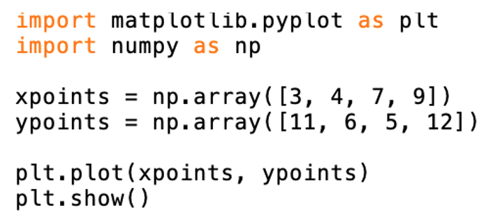
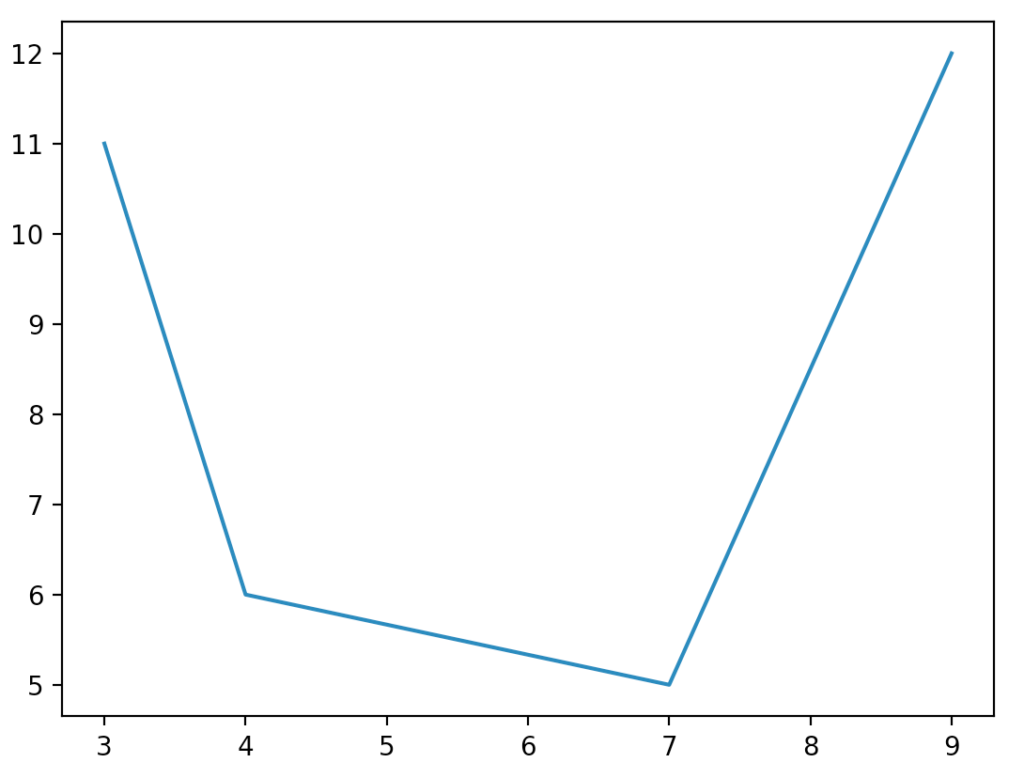
Throughout this chapter, we will present a series of Python programs that will show you the necessary basics for building your own charts and plots. In the first example, we include the coordinates for four points: (3,11), (4,6), (7,5) and (9,12). We store the x-values and y-values into two numpy arrays. Notice that when we imported the numpy module, we named the object as np.
Therefore, we use np.array to create the xpoints and ypoints arrays. Figure 15.1a shows the code used to plot the points and Figure 15.1b shows the resulting chart, which gets generated in a new window.
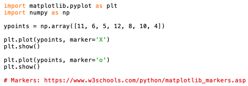
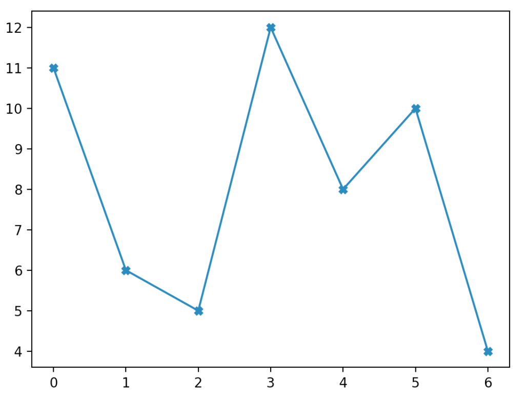
The second example demonstrates how you can change the markers for each point. Notice in the code from Figure 15.2a that two plots will actually be created. The second one won’t appear until the first window is closed. In the first plot (shown in Figure 15.2b), we show an “x” as the marker. The second plot, although not illustrated, uses circles as markers. Matplotlib provides dozens of options for the point markers. The web site w3schools.com has excellent tutorials on matplotlib, Python, in general, and many other technologies. In several examples, helpful links our provided.
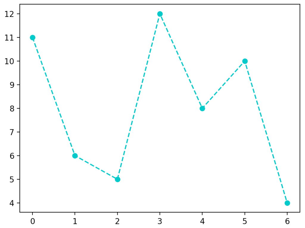
There are many ways to customize nearly any aspect of your plot. In Figures 15.3a, the code to modify the line marker, line style, and line color is provided. The options available for each choice are provided at w3schools. The resulting plot is illustrated by Figure 15.3b.

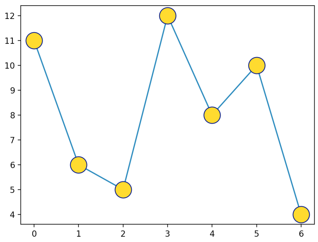
It’s also possible to customize the markers. In Figure 15.4a, we demonstrate how to modify the marker size, marker edge color, and the marker face color. The corresponding output window is given in Figure 15.4b.

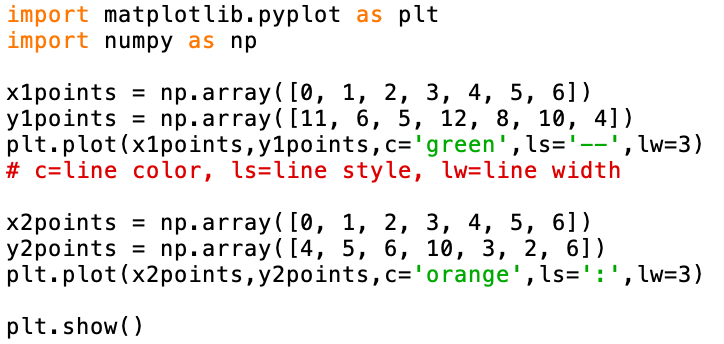
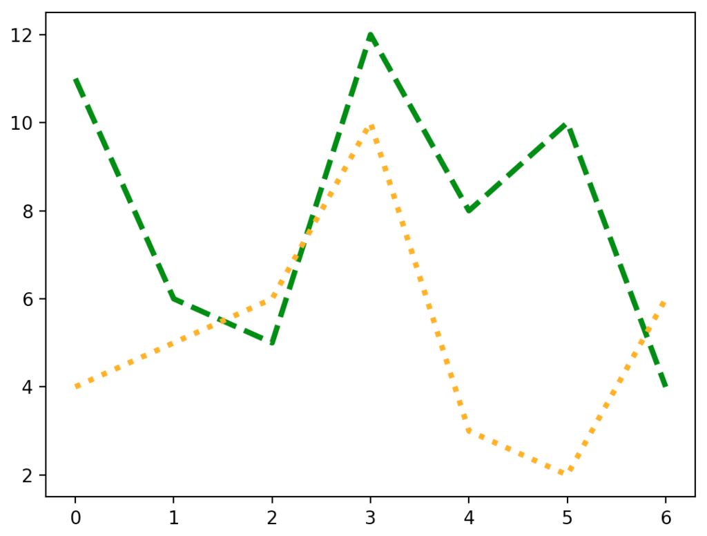
If you would like to draw multiple charts in one window, you simply call the plot() function for each chart and then make one call to the show() function at the end of your script. Figure 15.5a provides the code to accomplish this task. It also demonstrates how to modify the line color, line style, and line width when calling the plot() function. Figure 15.5b shows the output when this code is run.
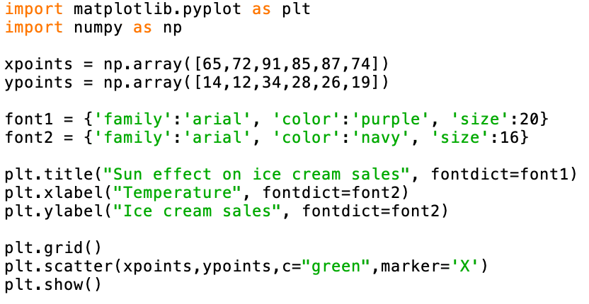
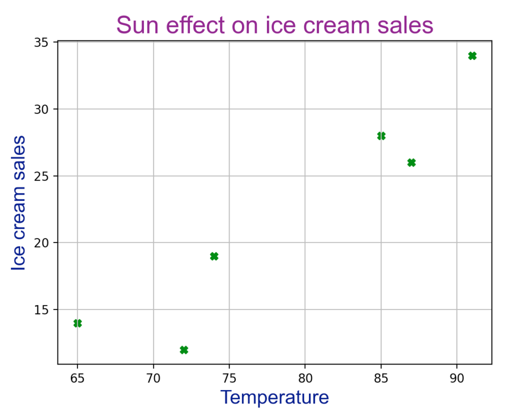
A scatter plot is a common way to visualize a set of data points using Cartesian coordinates. By looking at the plot, a pattern may reveal a relationship between the two variables. In Figure 15.6a, we present data from six summer days. Perhaps we were wondering if there was a relationship between the temperature (independent variable) and the daily ice cream sales (dependent variable).
In addition to creating the scatter plot, we provide code to add a title, and x and y labels, as well as add a grid. The resulting chart is shown in Figure 15.6b.
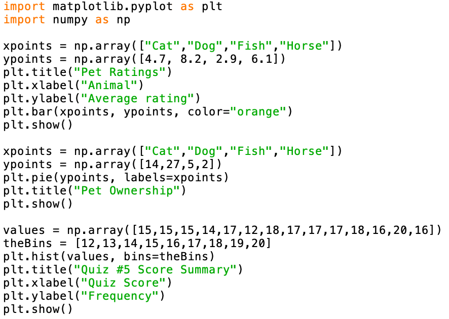
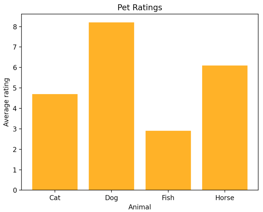
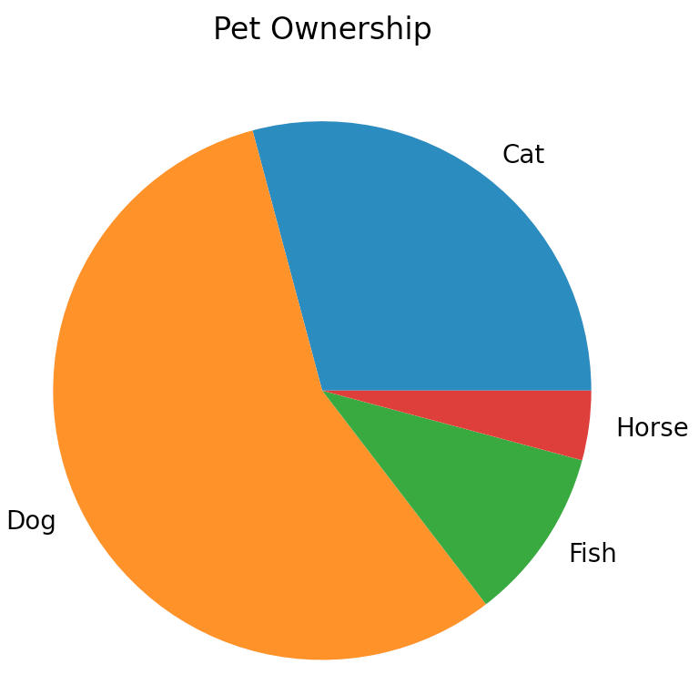
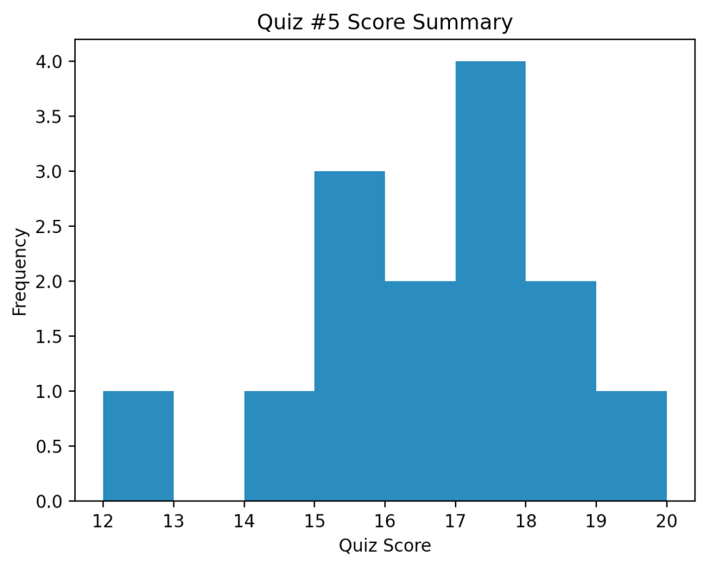
Because matplotlib is such a comprehensive library, it’s not possible to show everything in this short textbook chapter. In Figure 15.7a, the program illustrates three more plot types. The first example (output in Figure 15.7b) creates a bar chart showing user pet ratings. The second example (output in Figure 15.7c) builds a pie chart showing pet ownership. The final example (output in Figure 15.7d) implements a histogram. Bins are used to count the number of occurrences of each student quiz score.
An Extended Example: Moneyball
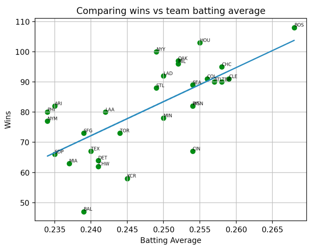
In the 2003 hit movie Moneyball, the Oakland Athletics major league baseball (MLB) organization used a sophisticated Sabermetric approach to scouting and analyzing players to build a team. The idea was to find undervalued players to fit into their limited budget. In the following example, we will simplify this process and ask the question, “Can I predict a team’s success based solely on the team’s batting average?”.
To do this, we need some data. Luckily, sports data is easily accessible, and it is free. A comma separated value (CSV) file from the 2018 MLB season is used and shown in Figure 15.8a. Each row of the file (MLB2018avg-wins.csv) contains a team code, the team’s batting average, and the number of games they won (out of 162). For example, the first row tells us that the Arizona (ARI) Diamondbacks batted 0.235 and won 82 games.

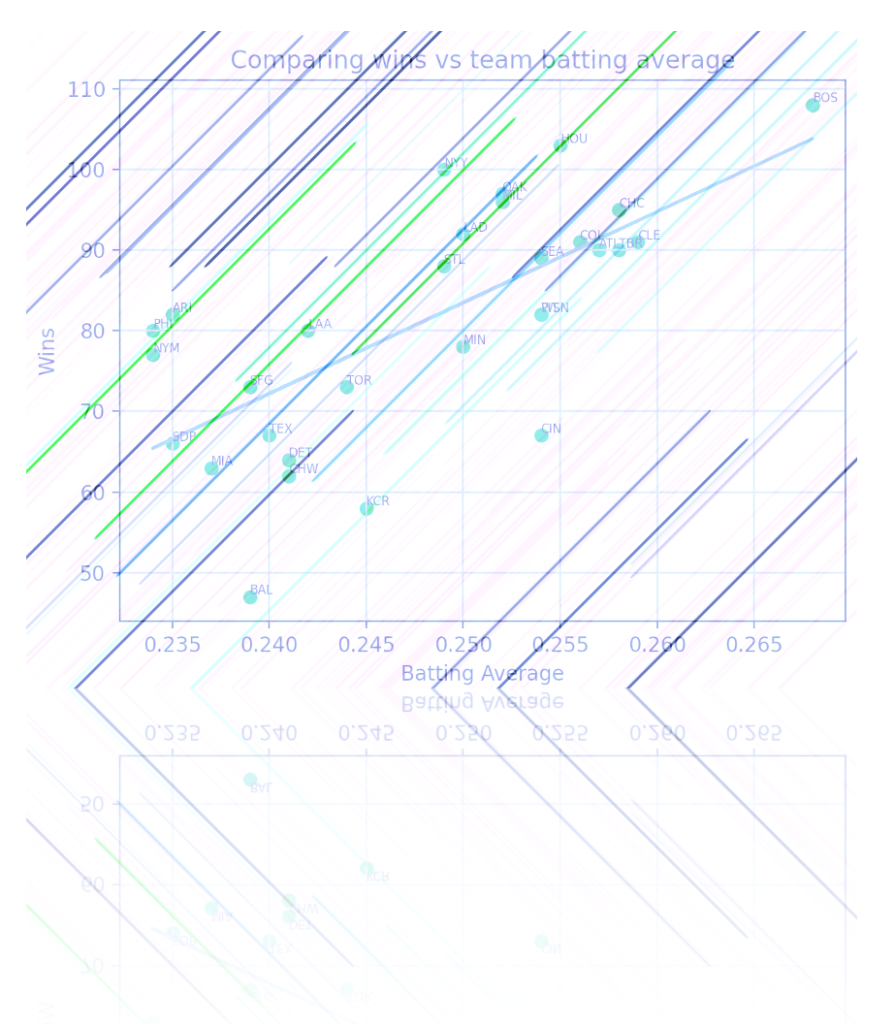
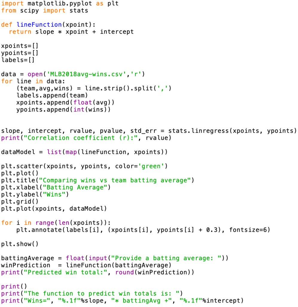
The program listed in Figure 15.7b first reads the data from the input file and stores the labels, batting averages, and win totals in their own lists. Like the earlier example, a scatter plot is created (see Figure 15.7c). The annotate() function is used to add the 3-letter team code as label to each data point.
Curious to see if a linear relationship exists, the scipy module is imported to call the linear regression function – lingress(). This function gives us the slope and y-intercept for the line that best fits the given data. We draw this line and show the equation for the line. Finally, we use predictive analytics to estimate a team’s season win total when a user inputs that team’s batting average (see Figure 15.7d).

Chapter Review Exercises:
15.1. Name five different chart types provided by the matplotlib module. Describe each one and provide a scenario for which each chart type would be preferred.
Programming Projects:
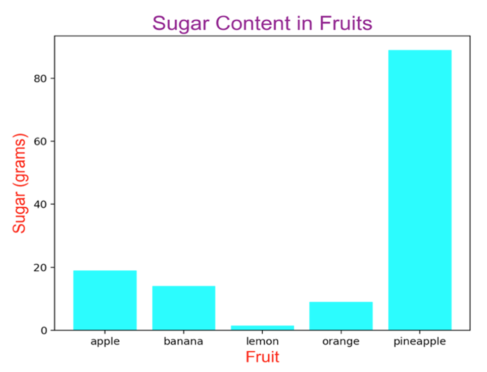
15.1. Write a Python program that generates the following chart. You should use the same techniques that were explained in class and in the textbook. You should exactly match the object sizes, colors, titles, labels, etc. as compared to the chart displayed below. This is a bar chart that displays the sugar content (in grams) of five different kinds of fruit (apple-19, banana-14, lemon-1.5, orange-9, and pineapple-89).
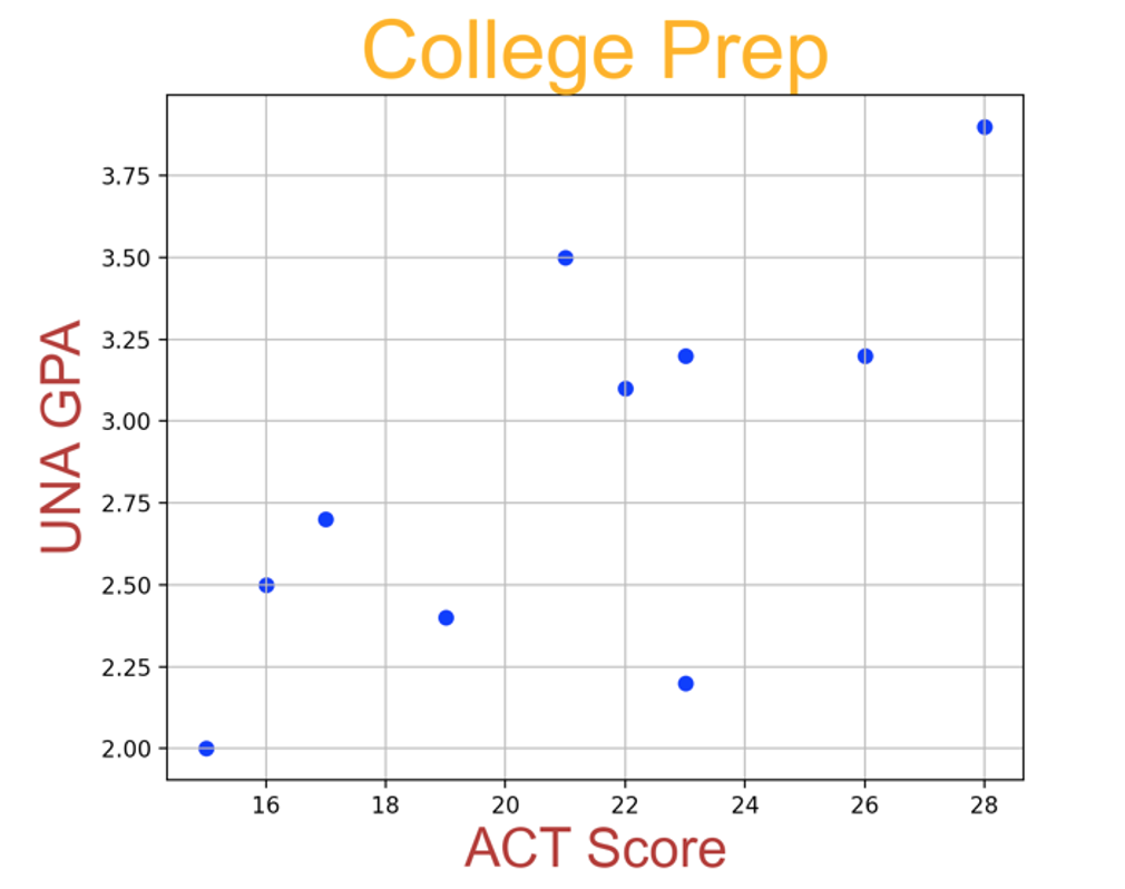
15.2. Write a Python program that generates the following chart. You should use the same techniques that were explained in class and in the textbook. You should exactly match the object sizes, colors, titles, labels, etc. as compared to the chart displayed below. This is a scatter plot that compares the UNA grade point average with their incoming ACT composite score. Data points for 10 students are used:
| ACT | UNA GPA |
| 22 | 3.1 |
| 19 | 2.4 |
| 16 | 2.5 |
| 28 | 3.9 |
| 15 | 2.0 |
| 17 | 2.7 |
| 26 | 3.2 |
| 23 | 3.2 |
| 21 | 3.5 |
| 23 | 2.2 |
